The Design Cookbook
The principles, patterns, and components that constitute the mertseven.com design system. This page is a living artifact, built using the very system it documents.
1. Core Philosophy: Clarity and Craft
This website's design follows the same principles as the projects it contains: it is built to be clear, functional, and thoughtful. The goal is to create a space where the work is easy to explore and the process behind it is transparent.
Function Over Form
The minimalist, high-contrast palette isn't just an aesthetic choice; it's a functional one. By reducing visual noise, the design helps you focus on the content—the projects, research, and ideas. The single accent color is used sparingly to guide your eye to interactive elements and calls to action.
Organized and Intuitive
The site is built on a logical foundation of grids and clear hierarchies. Whether it's the project sidebar or the layout of a publication card, the structure is designed to be predictable and easy to navigate. This respects your time and makes finding information straightforward.
Building as Thinking
Interactivity is used as a tool for understanding, not as a decoration. Instead of just a link, you get a live preview of a project. Instead of just a static list, you get interactive markers that reveal the site's history. The aim is to turn abstract concepts and project descriptions into tangible, explorable experiences.
Transparent Craft
This entire website is open-source. Just as academic research is shared for scrutiny and reuse, the structure of this site is available for anyone to view and learn from. This reflects a core belief in sharing knowledge and showing the work behind the work.
2. Foundation
Color Palette
The palette is strictly controlled to maintain high contrast and a consistent identity.
Page Background
#FFFFFF
Primary Text/UI
#000000
Primary Accent
#002fa7
Interactive Accent
#39FF14
Subtle UI BG
#f8f9fa
Typography
A dual-font system separates primary content from technical/code-related information.
Used for body text and general UI content.
Used for titles and important highlights.
Used for major headings to create strong impact.
For code, breadcrumbs, and technical details.
3. Core UI Components
Publication Card
The primary component on the Research page, designed for high information density and interactive discovery.
- Entire card is a clickable target.
- Year is presented as a corner badge.
- Key Interaction: On hover, the card inverts its colors, and the abstract slides into view. This rewards curiosity with more information.
Homophily studies in higher education
A bibliometric study investigating homophily in higher education, revealing patterns in how similar individuals form relationships...
Project Sidebar
A hierarchical navigation menu for the Projects page, built for clarity and quick scanning.
- Uses native
<details>for collapsible sections. - The
.activeclass provides a strong visual indicator for the current project. - Metadata
.badgeelements provide at-a-glance information.
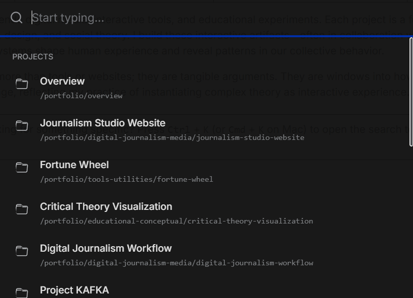
Search Terminal
A fast, keyboard-driven universal search accessible via a trigger or the Ctrl/Cmd + K shortcut.
- Provides a consistent, site-wide search experience.
- Search data is context-aware (projects, publications, etc.).
- UI is a dark-themed overlay for focused interaction.
Try it now by pressing Cmd + K (or Ctrl + K).
4. Page Layouts & Patterns
Split-View Layout
Used on the Projects page, this layout is ideal for information-dense pages. It features a fixed-width sidebar for navigation and a main, independently scrollable content area. On mobile, the layout stacks vertically for optimal readability.
<div class="main-container">
  <aside class="sidebar">...</aside>
  <main class="content-pane">...</main>
</div>
Interactive PDF Viewer
A mini-application embedded on the Research page to display the dissertation's visual paper. It is built with pdf.js and demonstrates the "interactive inquiry" philosophy by providing tools (zoom, fullscreen, thumbnails) for deeper exploration, rather than just a static download link.
Living Document System
A unique, brand-defining feature on the Homepage. Small, interactive markers are embedded directly in the text, revealing historical or contextual information in a popover on click. This transforms the site from a static portfolio into a dynamic artifact with a visible history.